grid_2-col
Universal26 · Component library · section is-inverse
This is not documentation. Every class shown here is a real global class, bound to a real project variable. Each specimen prints its class name and its bound variable. If changing a token does not change this page, the page is lying.
01 — Typography
Each class below carries its own family, size, weight, line-height, tracking and margin. Remove a second class from any of these and it still renders correctly.
heading_h0 · size/h0
Our Quality. Runs Deep.
heading_h1 · size/h1
Special and progress inspections
heading_h2 · size/h2
Construction materials testing
heading_h3 · size/h3
Geotechnical and environmental drilling
heading_h4 · size/h4
Nondestructive testing and GPR
heading_h5 · size/h5
Mobile laboratories
heading_h6 · size/h6
Pavement services
text_xxl · size/2xl
Nationally accredited since 1992.
text_xl · size/xl
One of the largest regional providers in the Northeast.
text_large · size/body-lg
Universal is a nationally accredited Special Inspection Agency by IAS, and a CMT firm accredited by AASHTO/CCRL in New York and CMEC in Florida.
text_base · size/body
We have been proudly certified by the NYCDOB since 1994. Our field and laboratory teams test concrete, soils, asphalt, masonry and steel against the governing specification.
text_sm · size/body-sm
Soil borings, rock coring, monitoring wells and test pits run with our own rigs and crews.
text_tiny · text/secondary
Report issued under License #0400. Figures rounded to the nearest unit.
subheading · text/accent-on-light
Special Inspections
text_label · text/secondary
image_credit — Photo: Universal Testing & Inspection
Est. 1992
02 — Color
Navy anchors, orange accents deliberately, ink carries text. No gradients as decoration. Bind to the semantic alias, never the core value, so a rebrand is one edit.
Backgrounds
Background / Primary
Background / Secondary
Background / Inverse
Background / Accent
Text
Text / Primary
Text / Secondary
Text / Inverse
Text / Accent on light
Text / Accent on dark
Text / Link
Brand orange #ec862c on white is roughly 2.2 to 1, which fails WCAG AA for text. It is correct as a mark, on rules and chips and the logo slash, and wrong as text. So the accent ships as two tokens and this page states which ground each is for.
Correct on light
Correct on dark
03 — Surfaces
Universal alternates navy bands with white and haze, so inverse variants are load-bearing, not optional. This band is plain section.
section is-secondary
The haze ground. Base classes need no combo here, text/primary still passes.
section is-accent, core/navy
The navy band. Everything inside takes an on-inverse combo.
section is-inverse, core/ink
Body copy on ink sits at white 70 percent rather than pure white. Full strength white at body size vibrates against the dark ground.
card on-inverse
Transparent fill, hairline at white 20 percent. No shadow, elevation is the border.
panel on-inverse
Lifted fill at white 10 percent, the one case where a surface reads above its band.
cell on-inverse
text_label on-inverse
04 — Spacing and layout
Vertical padding lives on section. Horizontal padding and max-width live on container. This is the single most common source of double-padding bugs. Universal26 previously had the horizontal padding on section; it has been moved.
Spacing scale
space/1
space/2
space/4
space/6
space/8
space/12
space/16
space/20
Grid classes
Gap combos on any grid: gap-none, gap-small, gap-large, gap-xlarge. Container widths: container is 1440px, container is-narrow is 1000px.
Layout
The base editorial_cells grid fills automatically at a 240px minimum. Add an is- combo when a band needs a fixed column count. Each variant carries its own responsive steps: 3-col and 4-col drop to 2 at 991 and 1 at 767; 5-col goes 3 at 991, 2 at 767, 1 at 479.
editorial_cells is-3-col
editorial_cells is-4-col
editorial_cells is-5-col
Components
The CMS listing row: thumbnail, discipline, location, scope, title and summary. Image-left at desktop, stacked below 767. Hover lifts the ground to white, insets the row and scales the image. Used on /projects.
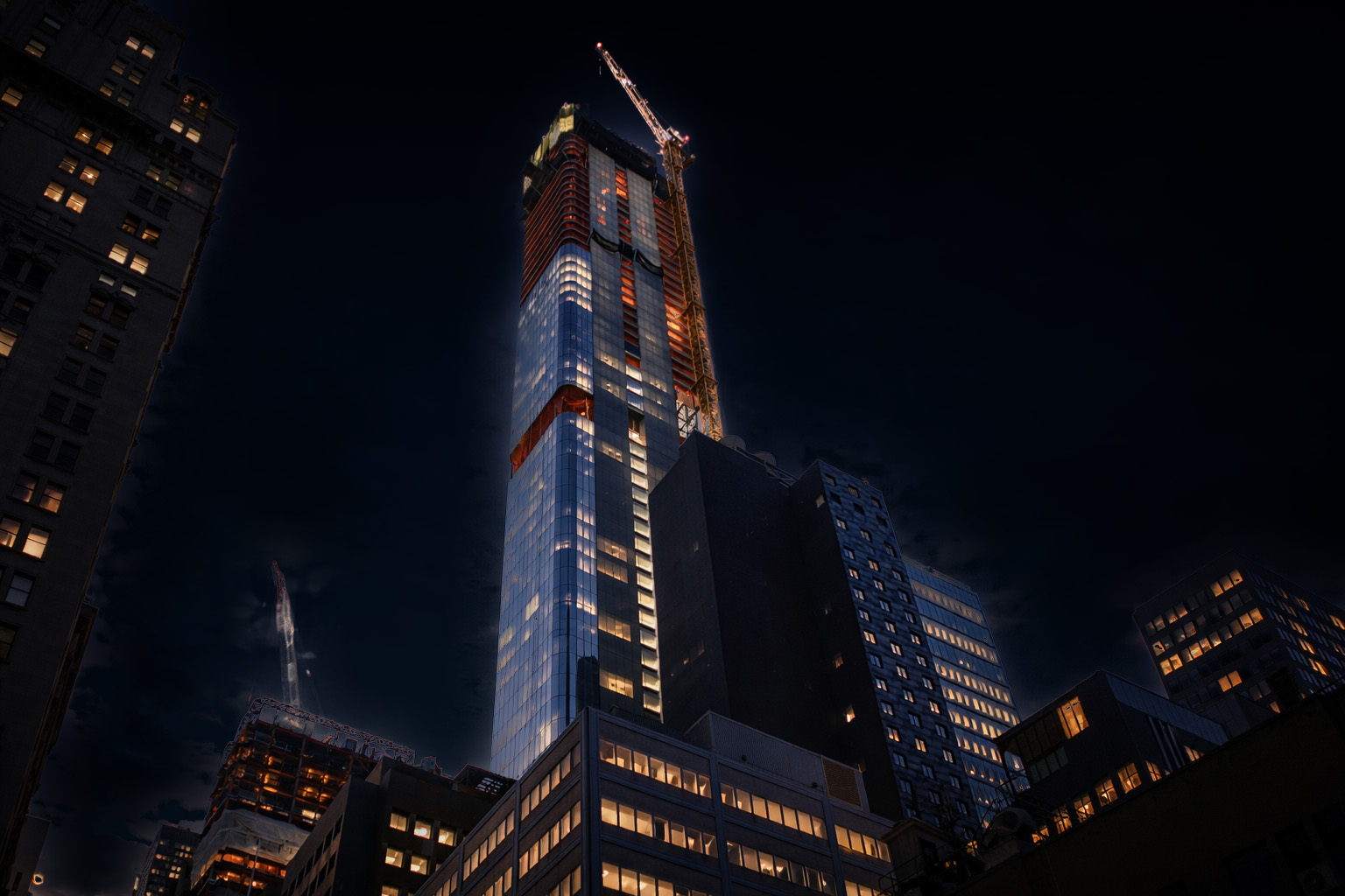
Concrete testing and QA/QC verification through a 1,100 ft structure.
Progress and special inspections across a phased transit program.
05 — Radii and borders
Square is a deliberate brand decision, not an oversight. Buttons, inputs, cards and tags are all radius/none. The radius tokens exist for incidental pills and avatars only. If you reach for one on a card, you are off-brand.
Border weights
06 — Components
button-group
button hover goes to orange-hover. button is-secondary hover fills navy with white text. Both were fixed this pass: the radius was set on one corner only, and is-secondary used white text on white.
card, card_title, card_body, panel
card
Hairline border on white. Hover strengthens the border to ink. No shadow, no lift.
card is-featured
Orange 3px top-rule marks the featured card. The only place orange carries structure.
panel
Haze fill for grouped content that is not a card.
tile, tile_media, tile_title, tile_meta
IAS
AASHTO
CCRL
NYCDOB
CMEC
FAA
list_item, text-link
input_field
07 — Naming
Parts and utilities
Component parts use an underscore: card_title, tile_media, nav_logo, footer_col. Utilities use property_value: margin-top_medium, text-align_center.
One base class per element. It must render correctly alone.
Combos and breakpoints
is- marks a real component variant, as in button is-secondary. on- marks surface context, as in card on-inverse. gap- sets spacing on a flex or grid parent. ix- is an Interactions hook only. tablet- and mobile- are responsive overrides.
Test a combo by removing it. If the element is now broken rather than merely unvaried, it was filler. Never invent a new prefix.
Layout-neutral link wrapper. Wrap an editorial_row in it to make the whole row navigate without changing a single measurement — it contributes no box of its own (display block, inherits colour, strips the underline). Use it wherever an existing row-shaped block needs to become a link but cannot be retyped as one. The live row below is wrapped in it.
08 — Legacy, being retired
Roughly 300 classes on this site are page-private vocabularies invented at build time. They are being migrated onto the library above, one page at a time. Delete this section when the migration is done.
Prefixes to retire
sg-* is 60 classes, this page's old scaffolding. ed-* is 70 classes on the editorial page. heading-style-h* and text-size-* are Client-first leftovers. Hyphenated component parts such as nav-logo, footer-col and svc-title should use underscores.
Duplicate definitions to resolve
Each of these exists twice, once as a global and once as a combo: sg-bar-2, -4, -8, -12, -16, -20, sg-navy-hover, sg-note-inv, sec-desc-inverse, ed-vlabel-inv and hero-stat-divided.
One base class for any CMS RichText field: body face, body-lg, leading/body, text/primary, with a @767 step down to body. The heading, list, quote, figure and rule ramp inside it cannot live on a Webflow class, so it ships as a style-only embed on each template that uses it (detail_411, detail_projects) until it is consolidated into site head code. Headings inside an article run one step below the page ramp — h2 uses size/h3, h3 uses size/h4 — and h4 and below become mono labels.
Body copy sits at size/body-lg on a 1000px measure (layout/container-narrow, the same token section_header uses), which holds a 70-to-80 character line.
Block quotes take a 2px border/strong left rule and the display face at size/xl.
Links are text/link, underlined at border/width, and hover to text/link-hover. Strong is weight/semibold.
post_meta is space-between by default, for a card footer with a value at each end. The is-inline combo left-aligns the run instead, for a meta line under a post title.